Today’s transport news

Knightsbridge

– Piccadilly Line drivers vote to strike (Standard)
– TfL survey recommends fixed Gallions Reach crossing (Bexley Times)
– Further consultation to be held on river crossings (London24)
– Boris’ £350,000 buses “creating jobs” (Standard)
– Transport Secretary looks to Brighton Main Line 2 (Brighton and Hove News)
– Young people asked to create 150th anniversary art (London24)
– Crossrail creates real-estate revolution (Wall Street Journal)
– ‘London transport developments leave regions out (Politics.co.uk)
– Why has Boris put the brakes on outer London cycling scheme? (Guardian)

Photo: Eric.Parker

Getting hot in here? If you’re on a tube at Oxford Circus, then yes, probably

Image

Image: TfL. Click for the full map

There’s nothing us Londoners love more than a bit of sun (except maybe free stuff). But be warned: while the sunshine makes the post-work Friday pint far more pleasant, it makes commuting a whole lot sweatier. If you’re prone to perspiration you might want to check out this map from TFL, showing the tube’s hottest stations (do not confuse with The Hot Line).

The map is based on data from 2010, but we doubt it’s changed much (global warming won’t kick in until we’re all dead, right?). If you have the time and the inclination you can use the map to plan a sweat-free route to work for those balmy summer days. Or you could just use deodorant, you slob, you.

So, just how cramped are you?

Issued under a Creative Commons licence

Issued under a Creative Commons licence

Finding out about the amount of legroom on trains is like trying finding out the Queen’s inside leg measurement: it’s risky, fraught with difficulty, and tantamount to treason.

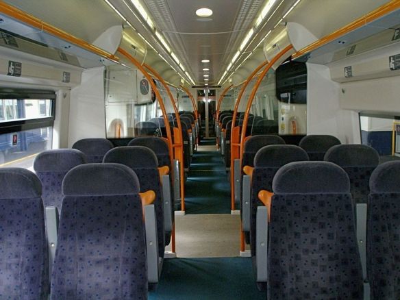
Legroom (or lack of it) is a pet hate of mine, having endured many journeys where I have had to sit perfectly still, lest my thigh come into contact with the stranger’s opposite. I mean, thigh rubbing is more a third date thing.

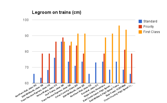
Having contacted all the major rail companies and been ignored/refused by all of them, the best figures available were courtesy of Justin Smith on railforums.co.uk. He measured the distance from the rear of the seat to where one’s knees normally would be. I converted them from inches to centimetres, and put them into a table, and a graph. The list is not exhaustive.

As you can see, Northern Rail is the worst train company, with all of their rolling stock offering just 66cm in legroom – that’s the same as a 26 inch telly. However, the worst single train is the East Midlands class 158, with 63.5cm of legroom. This train is a long-distance train that runs from Norwich to Liverpool – a journey that takes over four hours. Ouch.

At a third more room than Northern Rail, Hull Trains offers the most generous legroom for standard class passengers, at a capacious 86.4cm – the same as in first class. Finally, a reason to go to Hull! Out of the trains to offer ‘priority’ seating (generally for those who are disabled, with pushchairs or small children), only on Hull Trains is the priority seating more generous than in first class – but only by two centimetres.

The average length of seating in the eight trains with First Class is 90.8cm, whereas standard class in the same eight trains measures at an average of just 73.7cm. The biggest class divide is on the electric East Coast train (which runs on the West Coast Main Line), with 25.3cm difference between first class and standard class.

Part of the reason why it is so difficult to work out on which journeys you will be luxuriating in space or wedged in like a Lego brick at an orgy is because the seating layout is not dependent on the train company itself, but the rolling stock each company runs (i.e. looking at different carriages – trainspotting territory).

However, even if two train companies own the same type of rolling stock, they often refurbish the interiors to their own specifications. Therefore, it is highly likely that legroom on a train is almost as idiosyncratic as the train itself. Perhaps the best advice is to invest in a straitjacket, so you will be sure you can use the seat next to you to put your feet up.

Click to enlarge

Click to enlarge

What goes up…the cable car in numbers

cable car main image

The Emirates Air Line (as we must call it by the law of corporate sponsorship) has been open since June 2012. A short jaunt linking the O2 arena with the Excel Conference centre at the Royal Docks, the cable car has proved controversial: confusing some and baffling others. So just how many Londoners are commuting to work like a villain from a bad James Bond film?

Chart-animated

During the Olympics it reportedly got 70,000 visitors a week, but in those heady days Londoners believed they could fly and there was wiff-waff at the Excel Centre. Annoyingly, TFL figures don’t stretch back that far, but numbers hovered around 40,000 in the months afterwards, glimpsing their former glory in the first week of November, when 70,704 took to the sky.

Continue reading

Bank Holiday transport fun (or lack thereof)

A jolly out of London for the bank holiday – easy, right? Wrong.

Some of the many tweets horrified at the standard of rail transport over the bank holiday weekend, when Network Rail takes a holiday too.

  1. Worst Late Western seemed to get much of the brunt in the evening rush out of London:
  2.   First Great Western Trains are the worst form   of transport known to mankind
  3. But it’s not just William going LOCO:
  4.  40min delay on @FGW Padd-Taunton. Going to   lmiss connection. Not another for over an hour. Happy Bank Holiday!
  5.  Traditional bank holiday ‘national embarrassment’  ltrain journey home courtesy of @FGW
     

Tuesday (You)Tube

Low budget and barely original but still sort of entertaining video of the week: We know, we know. Another video about making commuting fun. They’re sort of missing the point, aren’t they? Commuting isn’t fun! It’s damn serious business. But we have a secret: we love Pictionary. Anything involving Pictionary (and sweets) we thoroughly approve of. Also from now on we will refer to the tube only as ‘the fundeground’. Deadpan voice compulsory.

Questions you didn’t ask: Couples discounts?

Wherein we answer questions you didn’t know you asked us, because you didn’t ask us them. It’s what boring people call ‘community generated content’. Sort of.

Dawwww. You sweetie-pie. Continue reading

Sometimes it’s quicker to walk!

You know the dilemma – it’s rush hour, it’s busy, and don’t know if it’s worth a walk to your station.

Well we’ve done the leg-work and found all the stations in zones 1 & 2 that are quicker to walk than to tube! Of the 62 stations in zone 1, 42 have stations nearby that’re quicker to walk to, making them potentially useless to you! Yay!

Click “View Larger Map” below to see the full map and list of stations.

Are there ones we’ve missed? Comment below in the usual place.

And check out this map from 2003 which gives quick walking distances on Harry Beck’s diagram.

The most pointless Instagrams of St Pancras

The most pointless Instagrams of St Pancras

As you know, St Pancras holds a special place in my heart because it is my commuter station. Which also happens to house the Eurostar, a champagne bar, designer shops, a piano and art installations. What does this mean? Photos Instagrammed to within an inch of their lives. Enjoy.

  1. Nothing like a bit of #hashtag #overload…
  2. Omg! St Pancras has a roof! Who would have thought it?
  3. Oh, look. People who have time to hang about. With suitcases. Bastards.