The 150th anniversary of the Tube has been heralded with artwork, steam trains, and special Oyster cards. All wonderful things, but they ignore the obvious: the London Underground would never be the institution that it is without people. And my celebration of 150 years of the network that carries me to work each day is a tribute to the faces behind those tunnels, roundels and murals. Happy birthday, tube.
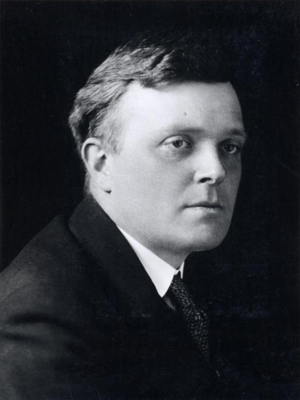
Frank Pick
Frank Pick is proof that even if you have an office job, you can change the world. Head of the London Underground in the 1910s and 20s, and of London Transport in the 30s, Frank commissioned pretty much everything we hold dear about the underground, from the red and blue roundels to Man Ray’s iconic poster of a planet next to an underground roundel. He also hired Edward Johnston (see below) to create the distinctive font seen on maps, signs and stations.
Frank wasn’t just about making the stations look pretty though – he pushed for expanding the network into the suburbs, spearheaded the effort to get tourists using the tube, and even insisted that upholstery for the train seats was specially made. When you ride all the way from Amersham to Baker Street, you can thank Frank.
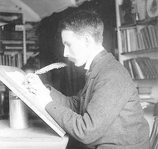
Edward Johnston
The clear, bold, but incredibly pleasing lettering that you encounter all over the London Underground was originally designed in 1913 by Edward Johnston , also known at the father of modern calligraphy. It is characterised by its perfectly round ‘o’ and square tittles (stop sniggering – it’s the dots on top of ‘i’s and ‘j’s).
The font was redesigned in the 1980s, but still remembers Ed with its name: ‘new Johnston‘.
His influence continues with the Edward Johnston Foundation, a research centre for calligraphy and lettering arts.


